An elegant timepiece for a more civilized age
Specs
Diameter: 34mm
Lug to lug: 41mm
Thickness: 10mm
Lug width: 19mm
Movement: Modified ETA 2824-2, 38 hrs power reserve, automatic, 28,800vph
TLDR
Gives the impression that you are a well-to-do Grandpa or mob boss. Wears like an absolute charm with one of my favorite cases ever. The two-tone is at once classy, warm, and charming, yet also somewhat tacky. It’s one of the flashier watches I’ve worn and I have to admit that I don’t really feel like I can pull it off.
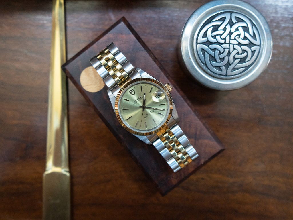
It’s got two colors
I’ve never worn a two-tone watch before and I probably would never have considered getting one if it weren’t for an unbelievable deal at my favorite hometown watch repair shop (thanks Charlie!). They have always struck me as anachronisms that belong back in the deep past, the 1980’s perhaps, my parents’ era. I believe it has something to do with the fact that most people sporting two-toners seem to be over the age of 60. They also remind me of the mob, proudly showing off that non-taxed wealth in shimmering steel AND GOLD. Maybe that’s just because the elder Junior wore a two-tone Datejust for several seasons of The Sopranos. Regardless, it isn’t me. I don’t like flashy, I never wear gold, and I generally don’t like it when my watch attracts attention, unless of course, it’s my vintage Seiko 7c43 diver catching the lustful gaze of a fellow Seikoholic. I too often find myself creeping on the wrists of unsuspecting men.
But after considering the steal of a deal and, as always, pinning for an Oyster case, I decided to try one out for a while, comforted with the fact that I could just sell it on if I didn’t like it. Well, I don’t want to sell it on. I do like it. The case is perfection. At only 34mm diameter, and a sexy slim 10mm thick, it wears like a shiny feather alighting on the soft mossy forest floor. It’s so light and unobtrusive that you might forget that it’s there, if not for the blinding strobe-like flashing of the bezel jumping out for attention with each subtle movement of the wrist. This isn’t my first Oyster case. I’ve owned another, more modern Tudor Prince Date 74000 with a smooth bezel and linen dial and even a Rolex Oyster Precision, both coming in at 34 millimeters, and both watches that I wish I could have kept in my collection forever. But alas, I can’t afford to have more than one or two watches in the rotation at once, so they had to move. But I never stopped missing that iconic, timeless case.
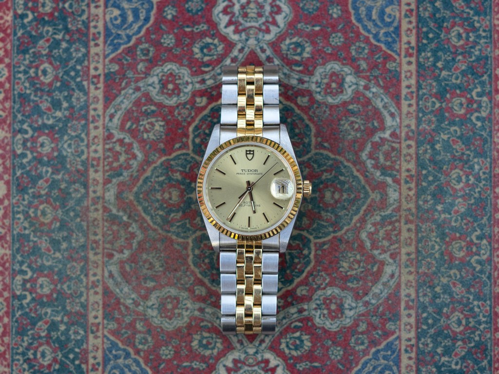
Blinded at the disco
This is, however, my first fluted bezel and damn does this thing shine. It’s like a disco ball spitting fractals of light out in every direction, changing with every move. And did I mention that it’s gold? Not just gold colored, not gold capped, but solid 18 karat gold. This is for me, however, a bit of a negative. I think I could handle an all stainless steel watch with a silver, white gold fluted bezel, but the combination of “Craft American Singles cheese product yellow gold” with the dizzying pattern puts this just over the line. I do love how it matches the pattern and color of the crown though.
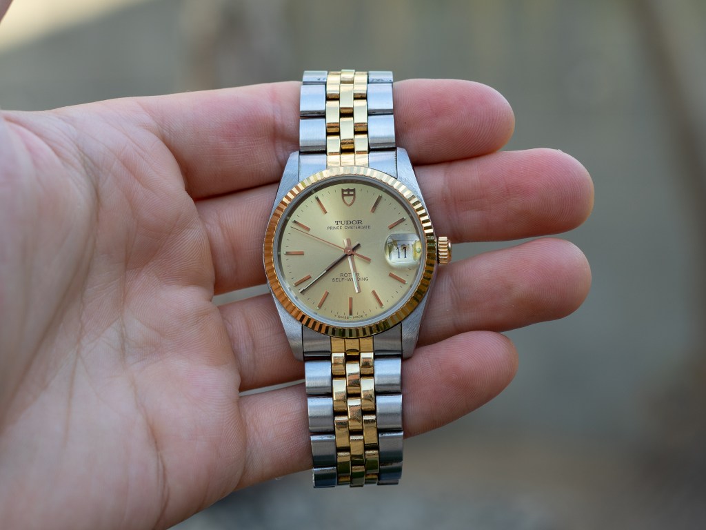
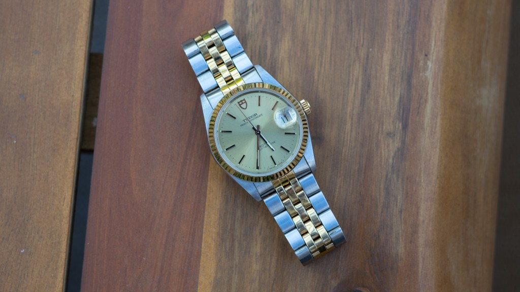
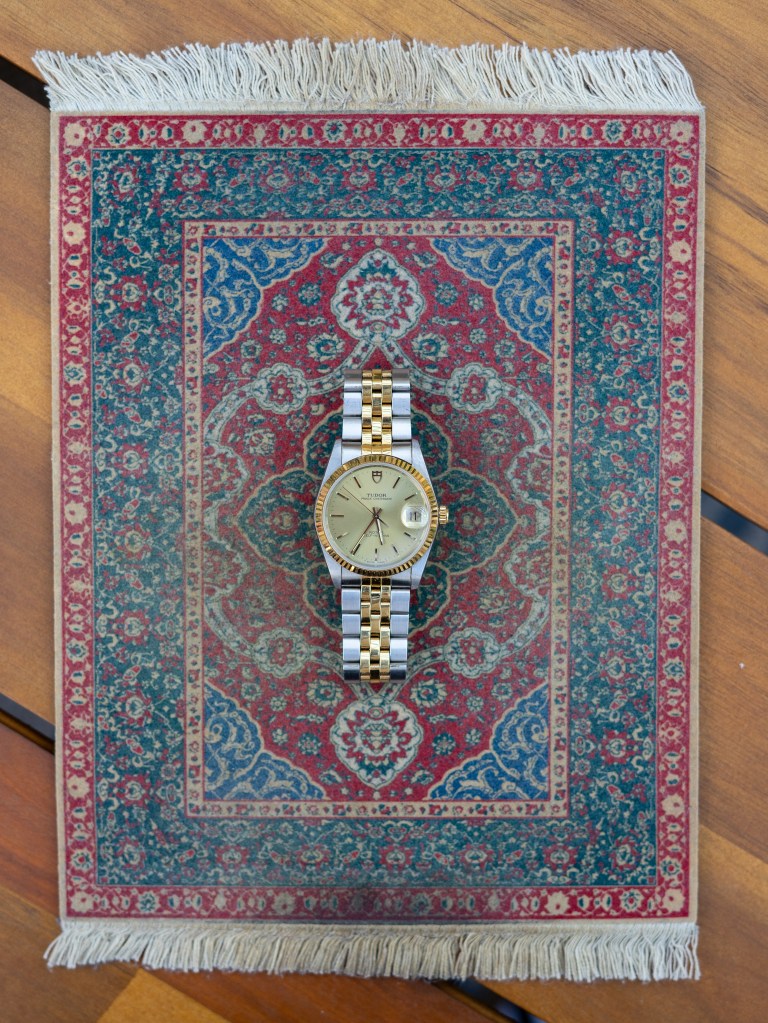
The dial is a tamer gold, almost champagne in color with radial brushing. The “becyclopsed” date wheel matches the dial, which I appreciate. Nothing ruins a beautifully brushed dial like a magnified, mismatched matte date wheel. Despite the gold-on-gold theme, it’s actually a fairly legible watch due to the high-polished, applied indices and the two-surfaced hands. Everything that protrudes on the dial catches light from any angle and makes time reading fairly easy in good lighting. In low lighting? It’s pretty damn difficult to tell the time. But this isn’t the kind of watch that puts function over form. This is jewelry first and foremost, in my opinion.
Jubilesque
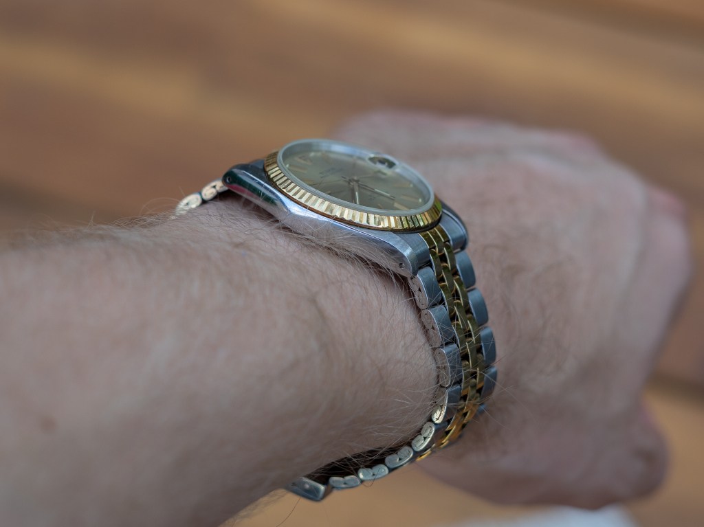
The Tudor Prince Date bracelets are quite interesting. They’re a cross between your common flat link oyster bracelet and a round link jubilee. Certain examples have three equally sized center links and lean jubilee, while others, like my previous linen 74000, have one larger center link flanked by two smaller centerish links making it perhaps a bit more oyster-like. The difference is subtle, but I easily prefer the latter. The two-tones end up having less gold in the middle, which is a good thing in my book, and the construction is much more solid, owing largely to the solid links. I also like how it sets the bracelet apart. It doesn’t seem as derivative from its Rolex counterpart.
This particular 74033, however, has folded metal links and the three matching gold center links. It’s jubilesque. Because of the cheaper bracelet construction the whole package feels incredibly light, but not to the point of feeling cheap. Just…cheaper than the oysteresque bracelet. It will lead to more stretch over the years, but my current example is only from the 90’s and seems to have been lightly used so it isn’t a problem. Charlie didn’t have any extra links, but considering the whopping 7 micro-adjust positions, it shouldn’t be a problem to sell in the future. This can fit a 6-inch wrist or a 7.5-inch one. My apologies to all you 8-inch Chads out there who never skip wrist day. This one will be a little tight.
To Gene
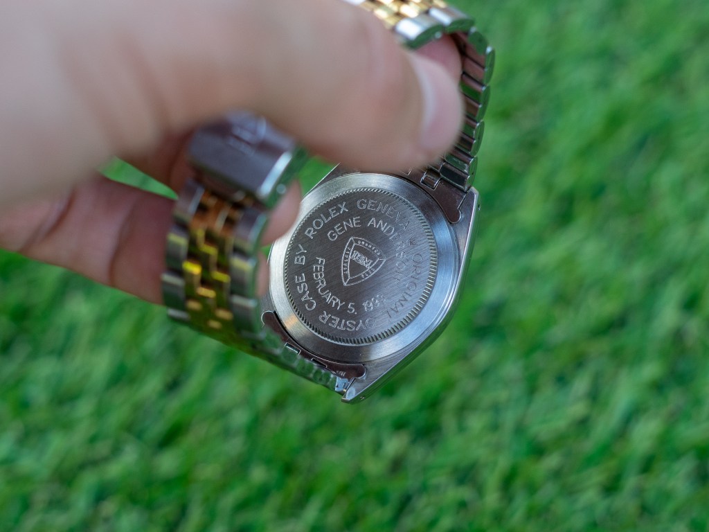
There is one special detail on my particular example that makes me even fonder of this watch. Engraved into the caseback are the IBM logo and the words “Gene Anderson February 5, 1993.” This appears to have been a company gift, likely commemorating Gene’s years of hard work. While I know that some people shy away from engravings, seeing them as a threat to the watch’s value, I always find them intriguing. They add a historical and personal value that I feel lucky to be witness to.
Funnily enough, I had seen an old Bruce Williams video on this exact reference and decided to check it out again after acquiring my 74033. I was shocked when I noticed that his too has an IBM engraved caseback. His is for a Gary, mine is for a Gene. How cool! (see my sources below to check out his video).
Value prop (I hate that term)
Well, like I said, this isn’t really a watch for me, but it has increased my interest in the dressier Oyster watches. Though the gold is a bit too much, I absolutely love the fluted bezel. It’s Pavlov-drool-inducing. I certainly hope to one day own a vintage Datejust, but after owning two Prince Dates I almost find it hard to justify. What makes the DJ four to five times the price? Sure, the Tudors house ETA movements, but that just means that they can be easily and affordably serviced. They’re perfectly reliable and you’ll never have trouble getting parts. Everything else is Rolex. You get that perfect, timeless case, the iconic disco ball bezel, the ever-divisive, infamous cyclops, and if you really care about branding you’ll often get a Rolex crown signed crown! Prince Dates can be found for great prices and are often in much better condition.
The modern 74000’s can even be found brand new, though I don’t think they’re sold in the US, and unlike the modern $7,000 Datejusts, they still have that vintage styling and the more desirable (my opinion) brushed top lugs. So, while the two-tone is a step too far for my personal style I am definitely interested in acquiring an all-stainless Tudor Prince Date in the near future, whether it be Datejustish with a fluted bezel and jubilesque bracelet, or Oyster Perpetualish with a smooth bezel and an oyster bracelet. Considered alongside their more beloved, praise-showered cousins the Princes are just too great a value proposition to pass up on.
-G

Sources

Leave a comment