Vintage style without the vintage maintenance
Specs
Diameter: 39mm
Lug to lug: 47mm
Thickness: 10.3mm (12.7mm including domed crystal)
Lug width: 20mm
Water resistance: 200m
Movement: Miyota 90S5, 42 hrs power reserve,  automatic, 28,800vph
TLDR
I think it’s a great value vintage-inspired dive watch. The double-domed acrylic crystal really gives it a nice vintage feel and the gilt dial is quite pretty. I love that Lorier made something different here, rather than just quoting the ubiquitous design language of more popular brands. That being said, it’s not for me and I rarely found myself reaching for it. The extreme taper on the bracelet makes the watch appear visually top-heavy and a little awkward.
A Microbrand Crowd Pleaser
Lorier has been a darling of microbrand fans ever since it started production. It set itself apart with an idiosyncratic design language that managed to capture the charm of vintage watches while still bringing something new to the table. Many pointed to the gilt diver as an affordable Black Bay 58 alternative, and as someone whose first ever blog post was a BB58 review, I can see what people are talking about, but the Neptune doesn’t need to be compared to any particular watch, as it can stand on its own achievements.
A New Vocabulary
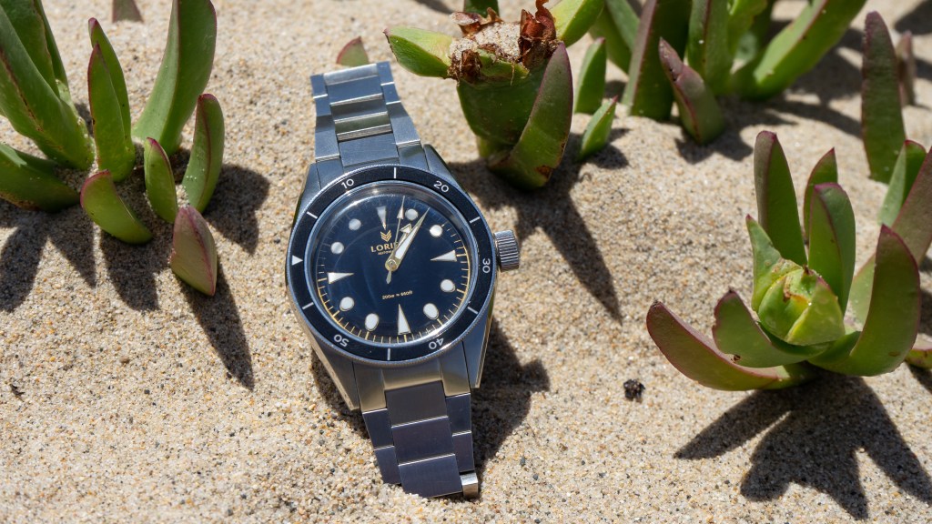
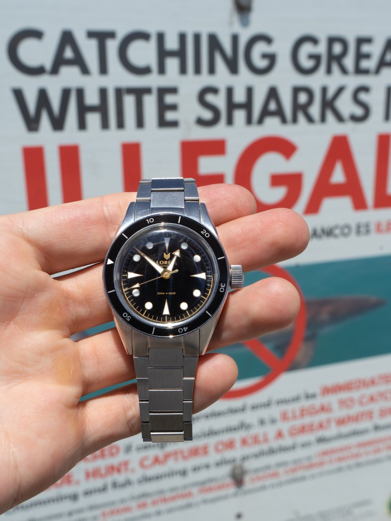
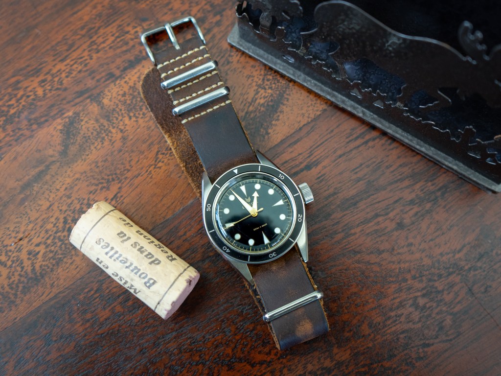
From the (very) oversized crown to the infamous elongated cat-ear lugs, the Neptune V3 has some rather unusual proportions that make for a unique wearing experience. The extreme taper of the flat link bracelet makes the watch look visually top-heavy and unbalanced. Due to the weight and high-quality construction of the bracelet, however, it doesn’t feel top-heavy. Instead of having an even and gradual taper, it tapers aggressively from 20mm at the lugs all the way down to its smallest point of 16mm in the space of only three links, then runs straight to the clasp. This steep slope contrasts with the sharp, flat design of the short links themselves, which some may find elegant. To me, it seems too abrupt. In fact, it’s probably my least favorite feature of this watch. I much prefer to wear this on a Nato strap; two-piece straps look pretty awkward due to the long lugs and the big gap between the spring bars and the case. These cat/bat ears don’t bother me so much though. I know many people complain that they are too long and extend past the wrist edge but on my relatively small 6.5-inch wrist the watch fits just fine and I enjoy the unique look.

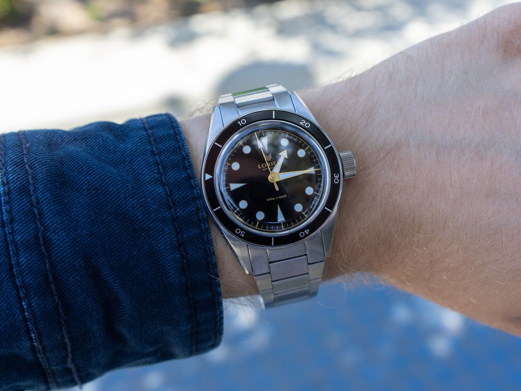
We should probably address the other giant elephant on the case, the crown. It’s very big. Bigger, proportionally, than any other crown I’ve seen on a watch (I haven’t yet handled an IWC Big Pilot). It’s like a lanky teenager whose legs grew a year too soon for the rest of him. Awkward, disproportioned, and always tripping over himself, he struggles for a year, but eventually evens out…or maybe that was just me. Unlike my bumbling, stumbling teenage body, however, this case shows no signs of growing into its crown. That’s not necessarily a bad thing design-wise and I’m actually a big fan of the look of the big crown, but it’s the practical implications that are a problem for me. Seiko famously solved the “metacarpal problem” by moving their diver crowns to the 4 o’clock position. This way you can have a large, accessible crown, without fracturing your hand every time you get up out of the water onto the boat after your dive, or in my case, up from the desk after typing. This proud and even brash crown doesn’t seem to care about my precious hand, though, and I can honestly see myself injuring it during extreme physical exertion (like, say, cutting vegetables using my professional claw-hand technique).
Beneath the crystal, the cues are a little more vintage-inspired and more conventional than on the case. It features a deep glossy black dial with contrasting gold and white accents. Because the paint on the chapter ring and lume plot surroundings is a bit duller than the color of the metal, the handset pops but almost too much. The hands don’t seem to fit in with their surroundings and sparkle brightly despite their flat brushed finish. Speaking of lume, the plots glow a pleasant fluorescent blue, but quite dimly, which is disappointing for a dive watch. That Smiths field watch puts this thing to shame. I can’t see this being a good functional diver, but I don’t think that’s the point of this watch. Like the BB58 that it is so oft compared to, the Neptune strikes me as a dress diver. From the cat ears to the teenager-legs crown, to the classy domed bezel and gilt dial, this watch puts form over function, and that’s fine for us less seaworthy adventurers. This is a versatile piece for the average user, again like the BB58. It can be worn in most settings, from the beach to the ballroom.
Under the Hood
Inside we have the Miyota 90S5, from the same series as the Smiths Miyota 9039. Like the 9039, this engine beats at 28,800 vph (8 ticks per second), has a 42-hour power reserve, and is charged by a uni-directional rotor that spins wildly like a fidget spinner every time you flick your wrist to check the time. I’m actually not sure what sets this apart from the 9039. It keeps reasonable time just like the Smiths at around -10s/day. It’s not an impressive movement by any means, but for the price, I think it’s perfectly acceptable and I feel comfortable knowing that service costs will be low.
Not For Me, But It Might Be For You
While the watch doesn’t quite fit my style preferences, I at least have to commend Lorier for their bold design choices. It’s easy to just make another Oyster case clone (see my Smiths review), but it’s a lot more impressive and daring to invent a whole new vocabulary. Yet…I have to admit that I enjoy wearing my Smiths much more, so I don’t think I will be hanging on to this one for much longer and I’m sure it will find a happy home out there with someone who connects with it more. It’s a worthy watch and I absolutely understand why so many people have fallen for it.
-G

Leave a comment